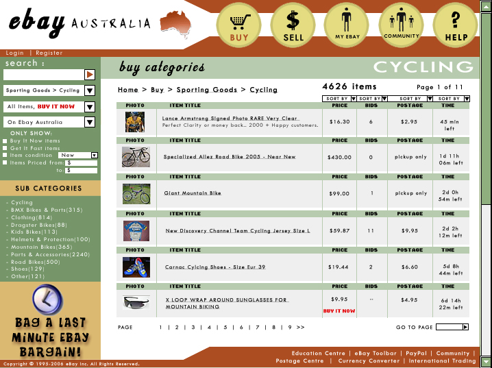
Back in my second year of university I was doing a design based subject that had an assignment where you had to redesign Ebay to what you thought was a more appropriate user interface. Remembering the Ebay site has changed quite a lot since July 2006, but these ideas were based on the site of that time.
Key elements:
- I took the angle of customising the site look and feel for an Australian audience. I chose a branding variance using an earthy Australiana colour palette.
- I wanted to use iconic representation by having chunky style ‘buttons’ as the main top navigation. The rationale was that users would associate with the pictorial icons better than plain text hyperlinks.
- I wanted to keep the search field consistent and as part of the left hand side nav and advanced search elements. I also wanted to incorporate Buy It Now into the search options (in 2006 this wasn’t yet an option).


